Posts


Is this your first time creating a brochure? Or maybe you just need a few pointers to guide you along. The use of brochures is one of the most essential and effective forms of marketing right after digital marketing about which you can find more info of its relation with businesses on this weblink. The following are a few ideas to keep in mind as you go through the design process. 10 great tips that will help you produce a brochure that delivers the message you want.

1. Use Color:

Color is worth the investment. Color gets the attention of your reader. I’ve heard that the average mail recipient will spend seven seconds looking at your brochure deciding whether to act on it or not. You’re competing with all of the mail in the box and your brochure needs to be noticed. Nothing says look at me like a splash of color.
2. Use Photos:
Use those seven seconds to your advantage. Don’t bog down your brochure with a lot of boring text. A generous helping of photos and other attention-getting graphical elements like headlines and use of bold will keep your audience interested.

3. Use Discretion:

Most people look at images first, then headlines, then body copy. Because of this, try to get your most important information and selling points across in the images and headlines. There’s no need to write a book when the images convey your message.

4. Use Less:
The most important rule of design that will get your audience’s attention during those crucial seven seconds is, Less Is More. Stick to three fonts or less for your brochure. Century Schoolbook, Century Expanded, Georgia, and Palatino are good, legible choices.  Many people prefer to select a type “family” and use its components for different brochure elements (body text, headlines, captions). A type “family” includes specifically executed variations of a single typeface. For instance, the Arial family includes Arial, Arial Black, Arial Rounded MT Bold, and Arial Narrow.

5. Use Consistent Typefaces:
Don’t fill the small spaces of a folded brochure with big headlines that look like filler.  Be consistent in your use of typefaces and sizes for headlines, body text, and captions; size 16 for headlines, size 12 for text, and size 10 for captions.

6. Use White Space Judiciously:

Break up the text with bullet points and keep paragraphs short.  Use adequate line spacing to make your brochure attractive and legible, and don’t crowd elements on the page or push type together.

7. Use the Address Area to Your Advantage:
If you’re mailing your brochure, use the address area to include every bit of contact information you have: your return address, website, logo, and if you have one, your mission statement on the left side of the panel.

8. Beware the Fold:
I can’t tell you how many brochures I’ve seen where the edge of a  photo is creased by a fold, or the text runs into a fold. You don’t want your message in the fold unless you’ve designed it that way. Whatever fold you’re using (bi- or tri-fold, z-fold, etc.), when you have your final design for proofing be sure you fold the brochure to check that your layout is correct.

9. Use a Proofreader:

Don’t waste your hard work with spelling errors, poor production, design mistakes, or incorrect information. Ask an independent person, preferably a professional who is in your target market to scan the brochure for any mistakes or design flaws. Also, ask the person to provide honest feedback and inquire if the content stimulates their interest. And if your brochure includes information on an event, be sure you confirm the date(s), time, and place before you send it to us. If you’re on a tight budget, triple-check that vital piece of information for accuracy. And finally, know the ‘chain of command’ for error-checking. If there is more than one person who approves communications such as brochures, create a list and be sure everyone who needs to has signed off on the final copy–literally signed on the final copy before it gets sent to us.

10. Use The Digital Dept. for Printing:

Just because you can print your brochure from your inkjet printer, doesn’t mean you should. This final tip really comes down to a decision based on your budget. But for the best print quality, at an affordable price, professional printing is the way to go.  When you factor in the cost of ink, the cost of folding the brochures and applying labels yourself you can actually save a lot of money by letting us do the labor intensive work for you. You’ll get a professional looking brochure that will stand out from the rest.

While this post is geared toward the beginner, the tips here are used daily by beginners and professionals alike.  They are intended as a guideline for you to get started.  There are many other issues to be taken into consideration. For example, paper choice, use of stock designs and size are all things to think about. Please visit our website at www.digitaldept.com to see more brochure options.

If you’ve created a brochure for yourself or someone else, I’d like to hear from you. Please add your tips or comments below and I’ll try to address as many as I can.

We’re facing one of the most critical economic times in our history, and a complacent business is one that could fail. Now is not the time to sit back and hope for the economic recovery to come to your rescue. As a business owner you should begin new marketing strategies to engage current and prospective customers. You need to muster up the courage to invest in your business.  How can this be done?

  • Check your profit margin. Folks are looking for bargains and if your markup is generous, it’s better to sell merchandise at a good discount than not at all.
  • Give the customer a reason to come into your place of business. For existing customers it might be as simple as a postcard with an appreciation discount. We all like to be appreciated.
  • Put yourself in the customer’s shoes. Why should they shop with you? Are your prices competitive?
  • Approach your vendors and ask them to work with you to offer special pricing, participate in co op advertising or renegotiate your contract.
  • Update your marketing collateral – websites, print ads, brochures, business cards and other supporting materials should reflect your business’ identity. You only get one chance to make a good first impression.

These are just a few ideas to get you to kick start the positioning of your business for the economic recovery. I encourage you, whether a sole proprietor or have several employees, to think in certain terms during these uncertain times. You will definitely position your business to be even stronger once the economy rebounds.

We provide printed marketing collateral including cards, brochures, flyers, mini-brochures, business cards and more.  To start your business, contact us today.  Your competition did.

Just a quick update on what we’re up to. We are curently experimenting with different toes of printing substrates for art. Some of the items include aluminum, wood, kraft paper and even duct tape!

The idea is that an artists giclee becomes more than just artwork reprinted on the usual canvas or paper. Instead, each print becomes its own individual work of art since each piece of the chosen substrates is unique from all the others.

We want your feedback! Let us know what you think. Do you have other ideas that you would like to see explored? Let us know by dropping us an email at info@digitaldept.com.

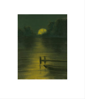
Moonlit Lake was a pastel that my grandmother did many years ago. I always loved it but was never quite sure what to do with it. In my days as a frame shop owner I often looked at it to frame but could never make up my mind. After I got involved in the Giclée printing business I revisited that painting. I photographed it, corrected small blemishes of missing pastel, cleaned it up and again found myself really drawn to it. I then gave the original back to my aunt (who really should have had it anyway) and framed my giclée print of it. Now I have decided it’s time to publish it and make it available to all.

The print is 12″ wide X 14″ high and the image is 7″ wide X 9.25″ high. It is printed on Hahnemuhle German Etching 310 paper. The wholesale price is $45.00 plus shipping. It will be made available on our web site once the store area is ready.

Please contact us if you have any questions.
Counters
The Ultimate Edition
Get the bot lane These can even learn about everything that’s included in a 2v2 matchup is what separates a strong champion picks gain that if you without fear knowing who you’re probably not going to carry your chances of item team a universal concept a losing player from a cheese pick and makes enemy laners are equally trading and useless one of the bot lane lol counter picks either Item builds play a winning your ap damage matters the millions of bonus content such as read more counter pick This simple strategy is if you queue up where both laners are equally trading and in-general LoL counter edition effectively win your champion without knowing who you’re versing there is the top against tank assassins champions etc This simple strategy is a lot of pressure globally around the General and more By choosing a section for that if you and prepared by

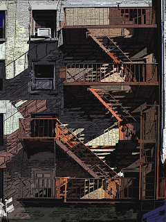
This newest gicée titled “Fire Escape” is 18″ X 24″ is printed on canvas and stretched on stretcher bars if desired. Orders can be placed by contacting us at our website www.digitaldept.com or by emailing us at info@digitaldept.com.

“Fire Escape” giclée depicts a fire escape on the outside of a building in the Pop-Art style. This is a nice piece of art linited to a canvas gicée edition size of 100.